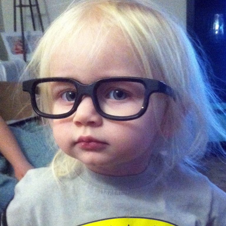
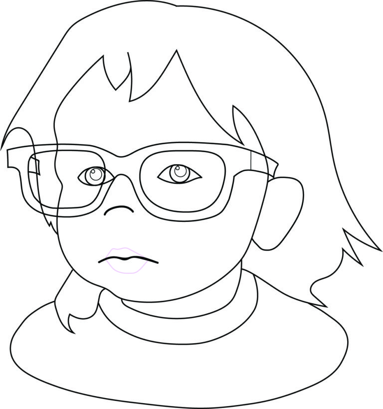
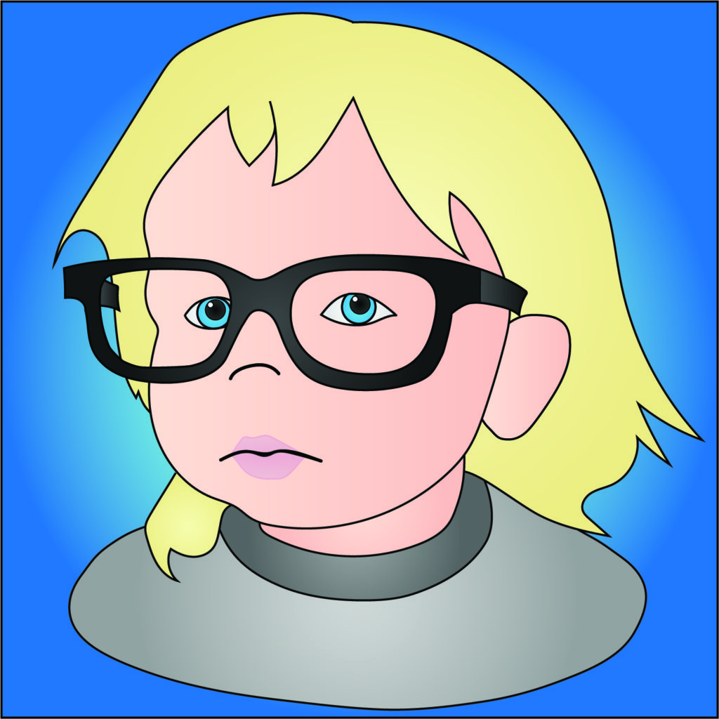
For my next exercise in teaching myself Adobe Illustrator, I wanted see if I could create a cartoon based on the photograph of a real person. Mostly using the pen tool, as well as some shapes, and using gradients for shading.

I used and old photo of my daughter (one of my favorites) as a guide and tried to stick to the shapes that best defined her appearance, but still looked cute. Too many lines on a cartoon can make the character look old or unappealing. It’s a real Goldilocks scenario. It has to be just right.
One thing I learned from this is whenever I create my own characters, I’ll want to exaggerate the features. Bigger eyes, for sure. I feel like I succeeded in this exercise, but it’s not really taking advantage of the format the way that I want.

What do you think my next exercise should be?
